
dusk airlines
branding
I was challenged to take an old airline, Continental, and redesign it as a more modern brand that would succeed today. The first step was researching why Continental Airlines failed. I discovered that their design felt outdated, and their business approach was lazy. They were unreliable and had a poor reputation, causing stress within their customers. I decided to complete a full rebrand and attempt to create a comforting aesthetic that would spark relaxation and desire to revisit the new brand, Dusk Airlines.
I created a new airline with a user-centric intent in order to inspire safe and enjoyable travel. Dusk Airlines is tailored towards the busy and tired, offering a calming experience that promotes relaxation. Instead of the brand being all about the airline, I wanted it to attract travelers and truly emphasize the desire to put customers first. It is set apart from the hustle culture found in competitors and strives to make the flight an experience itself, providing top-notch seats and amenities, as shown in the design applications.
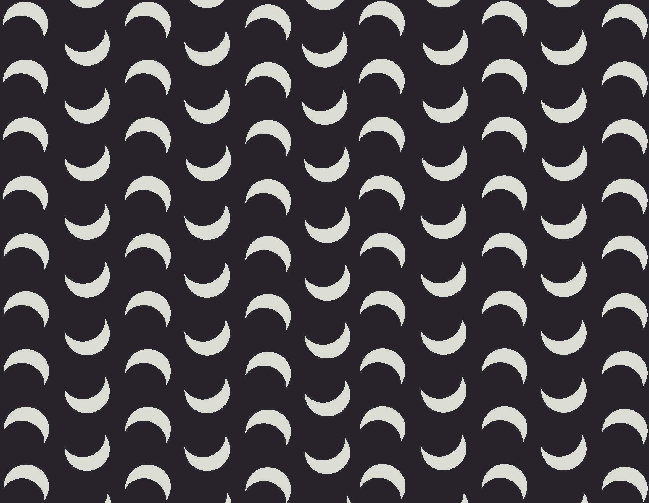
I built the branding and logo with the intent of creating a very clean, simple, and luxurious design. The serifs in the typeface Cinzel really helped bring that sense of wealth to life. In swapping the leg on the K to match the R and playing with the spacing between counters and stems, the font became the wordmark. In order to replicate dusk in a very minimalist way, I split “Dusk” in half to create the sense that the sun is setting without having to incorporate illustration.
logo system

Monogram logo.

Wordmark.

Primary full logo.
branding applications

Plane wrap.

Marketing poster.

ID badges.

Eye masks.

Throw blanket.