

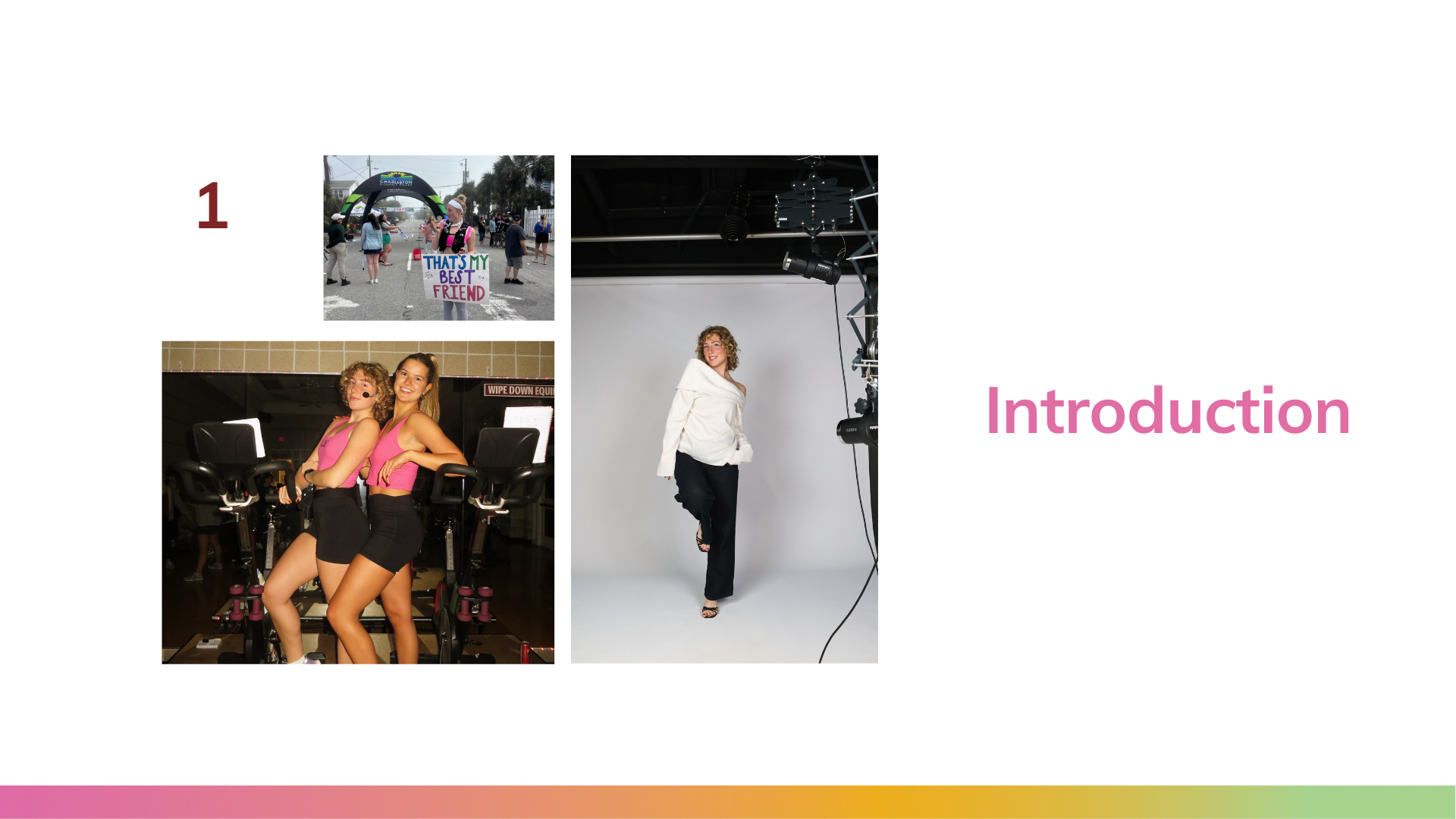
ExplorHer
ui/ux design
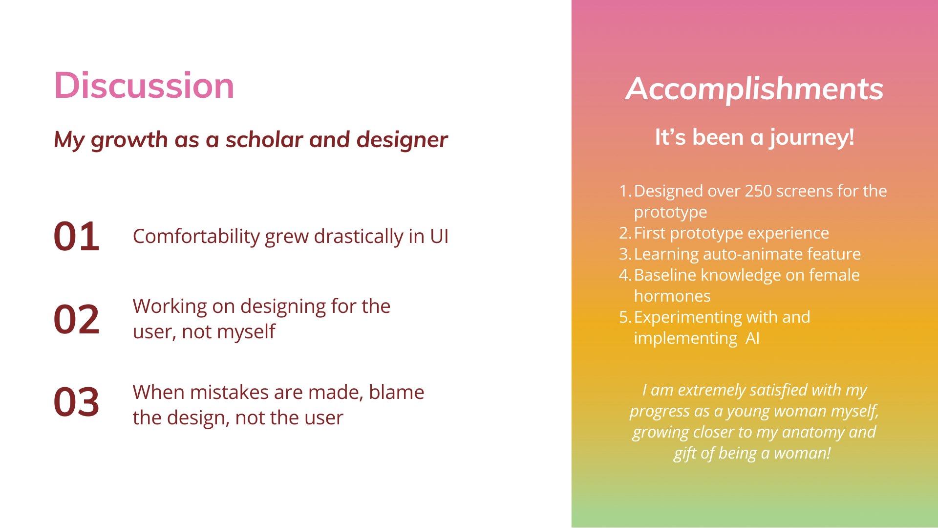
I designed ExplorHer to test the intersection of female hormone health education and interactive design. This project surrounded strategizing, planning, and designing a mobile app that solves a gap I believe to be present on the market: reliable female hormone health education.
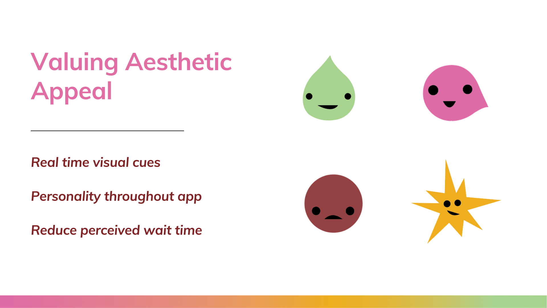
Combining UI/UX design allowed me to predict user interaction and design an app that allows for quick and fun learning on female hormone health that is credible and research-backed. Read about my entire thought process and view my design plan below, jump right in with exploring the prototype, or scroll to watch a quick demo!
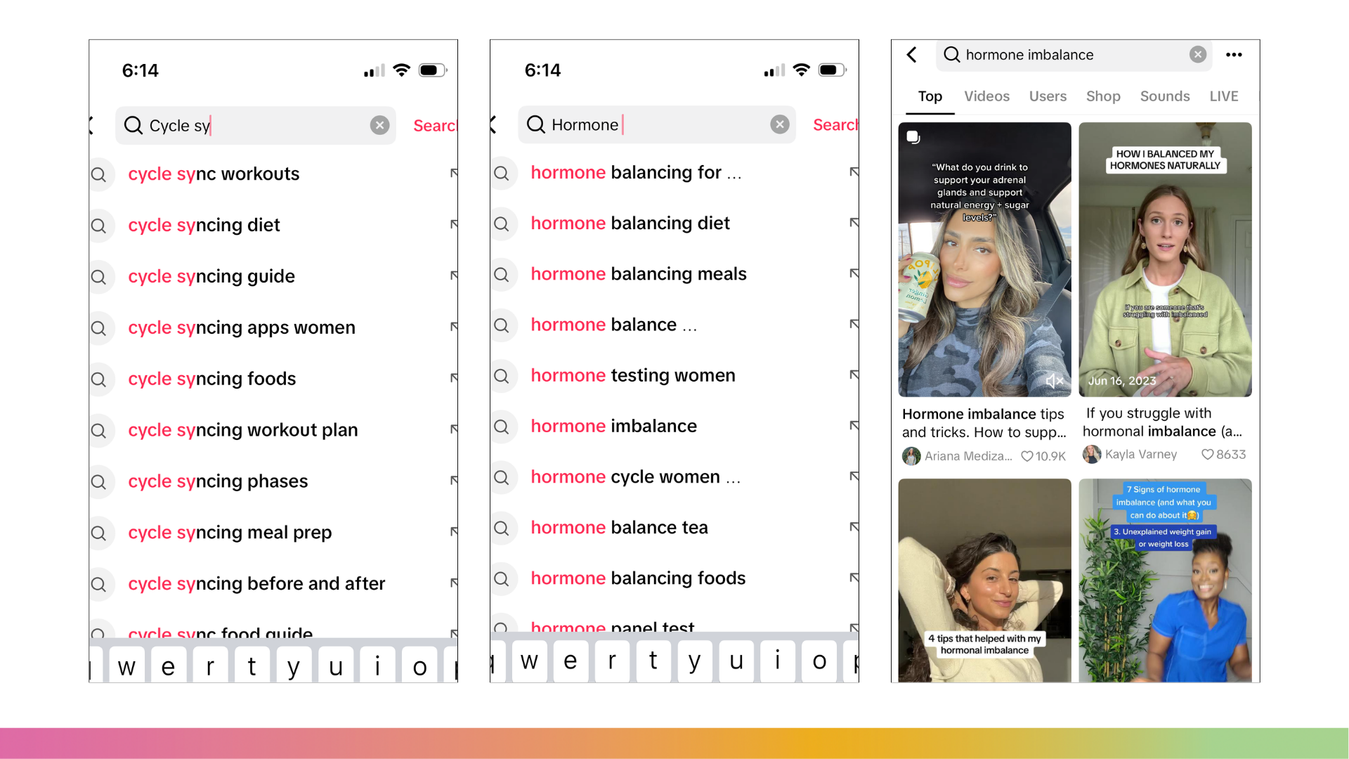
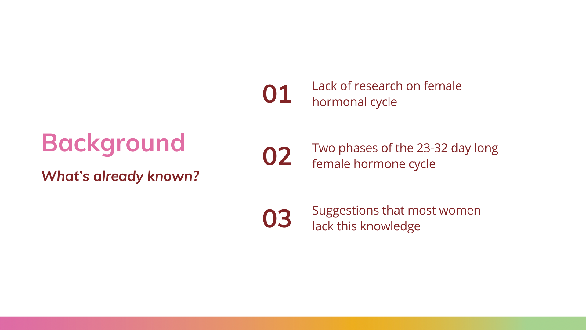
the purpose and problem
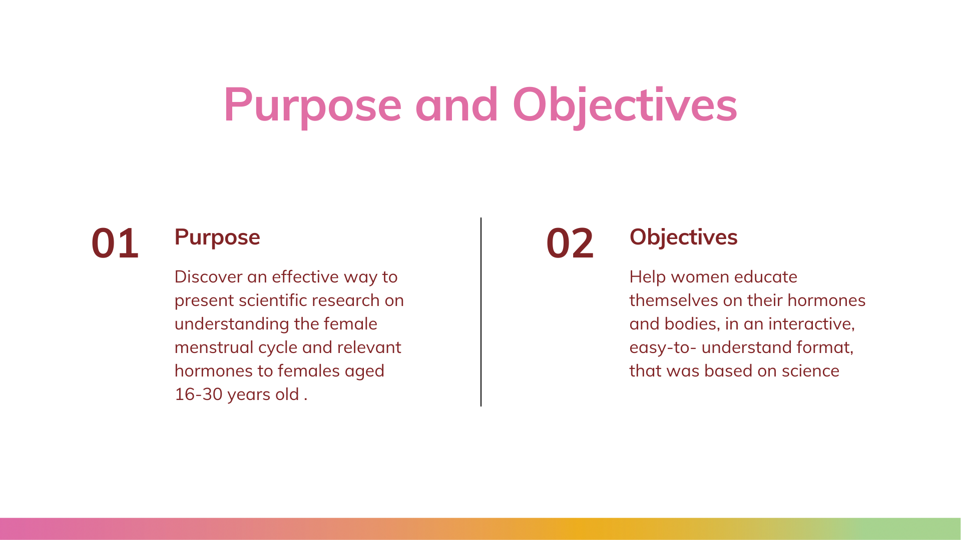
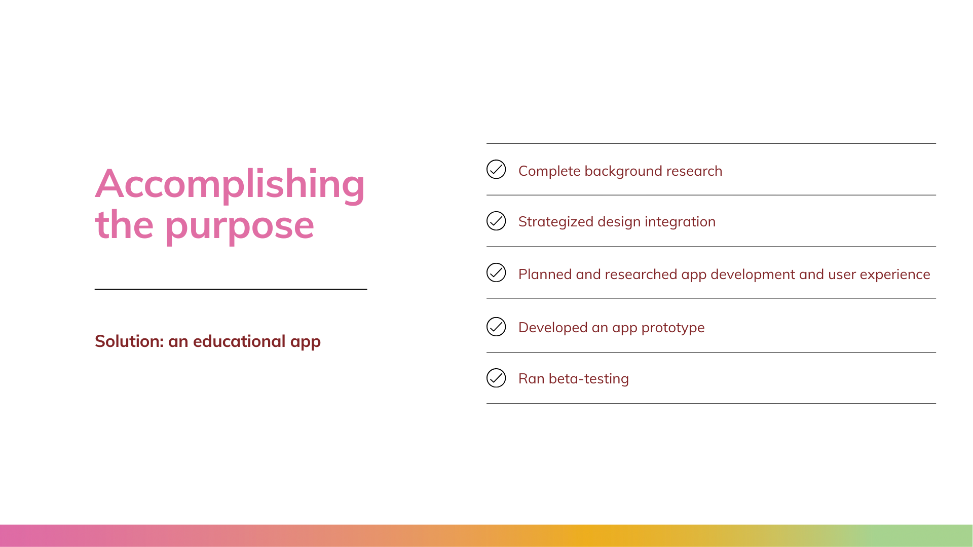
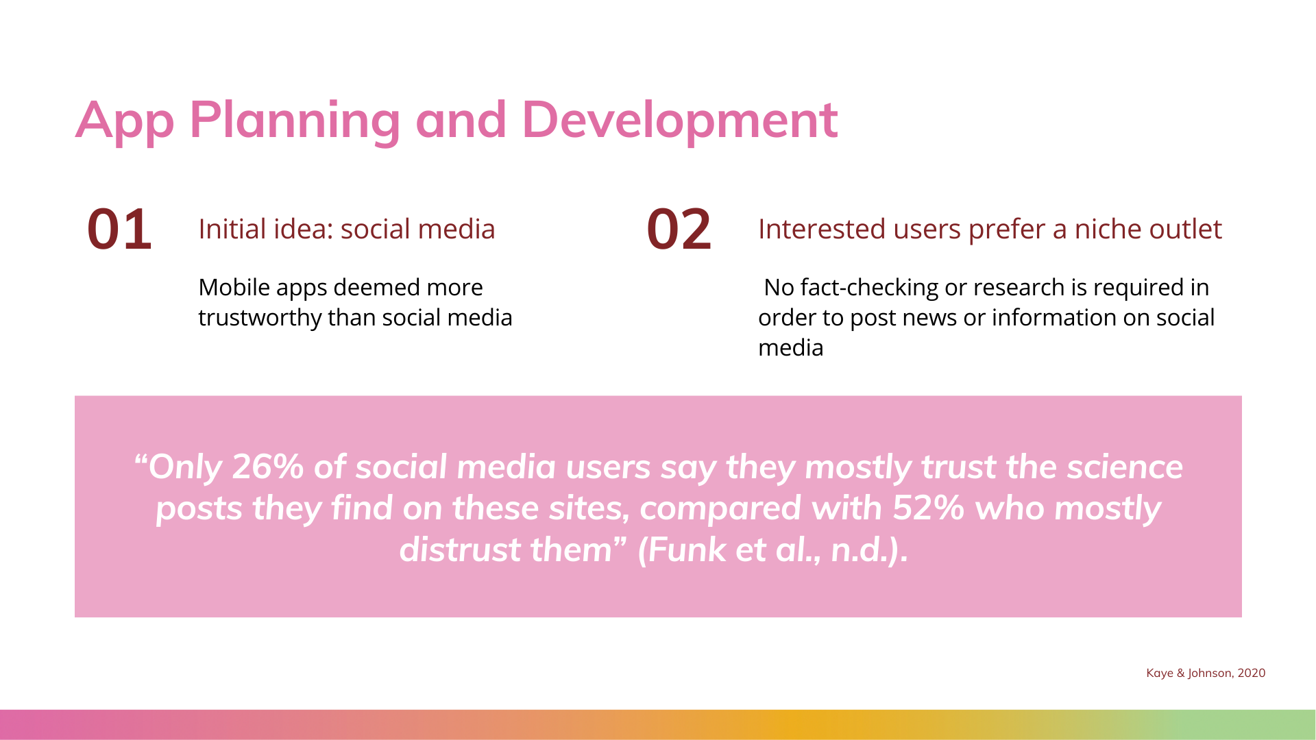
The purpose of this thesis was to discover an effective way to present scientific research on understanding the female menstrual cycle and relevant hormones to females aged 16-30 years old. In order to achieve this purpose, I decided to develop an educational app, with the goal of helping women educate themselves on their hormones and bodies, in an interactive, easy-to-understand format, that was based on science. To develop the app, I completed background research, strategized design integration, planned and researched app development and user experience, developed an app prototype, and ran beta-testing through the University of South Carolina’s Biometrics and User Experience Lab.
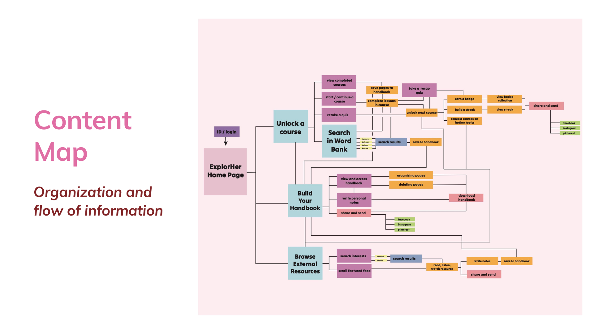
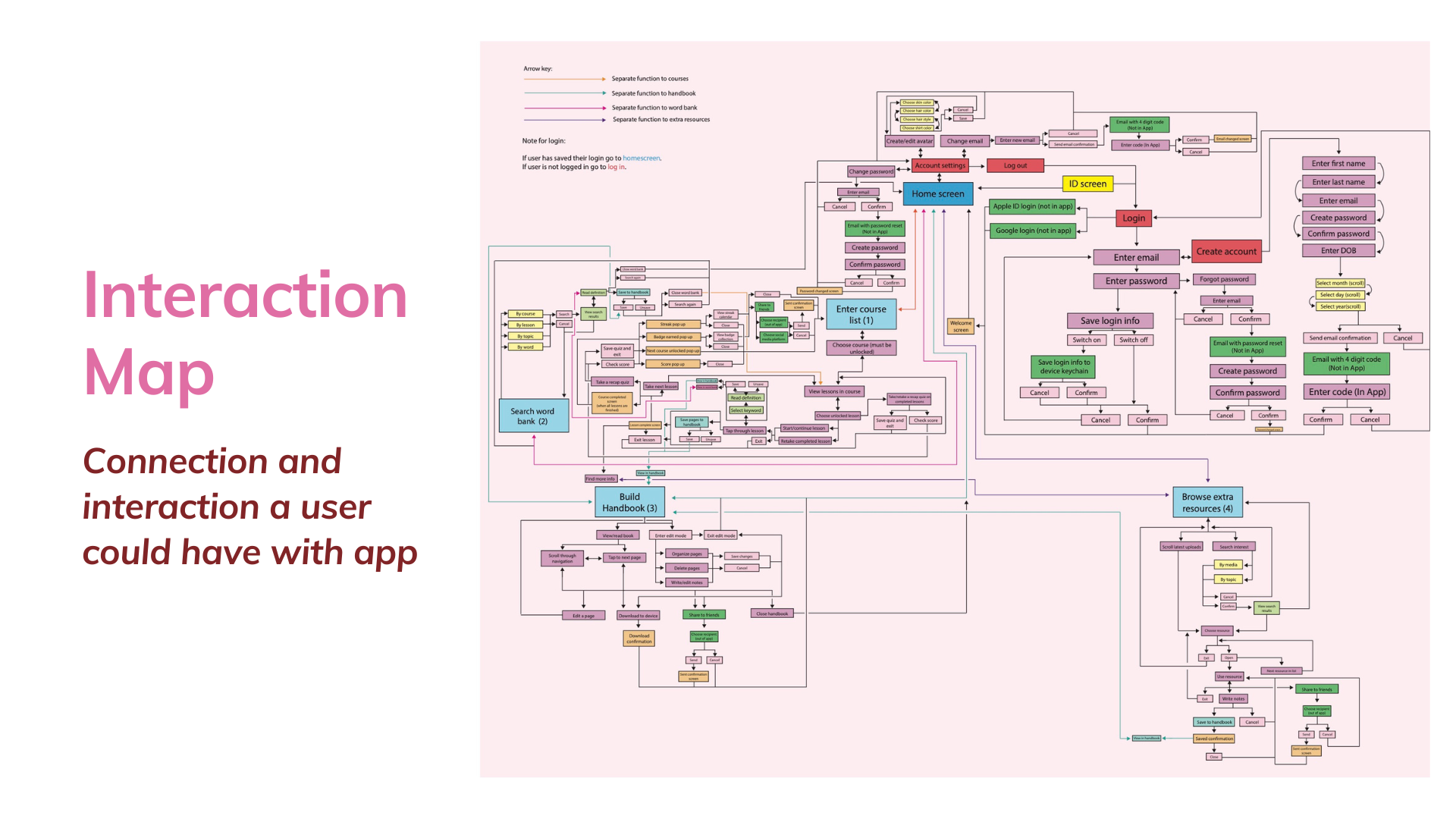
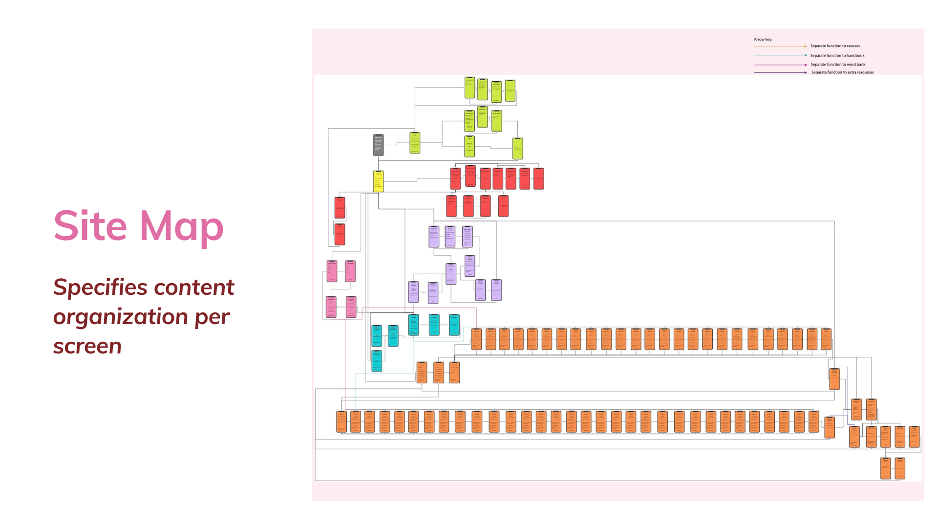
user experience mapping and product development

Content map.

Interaction map.

Site map.

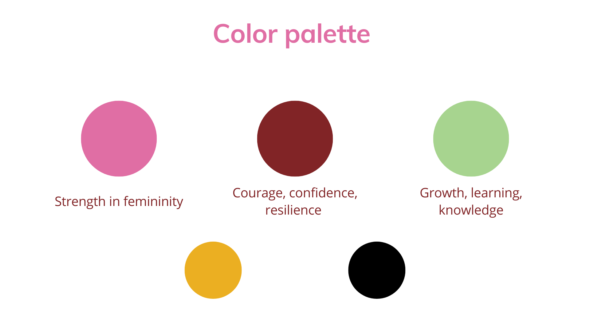
Mood board.

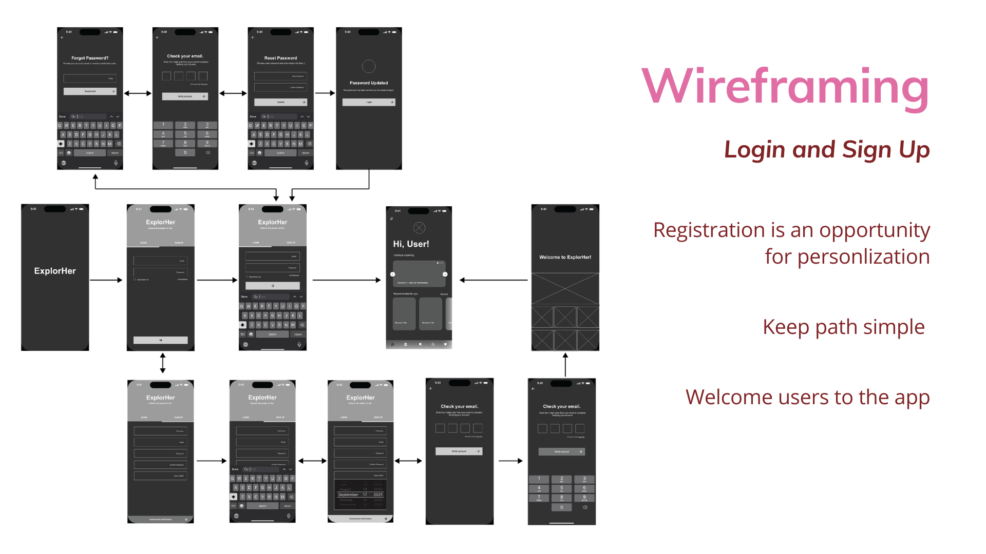
Wireframes.

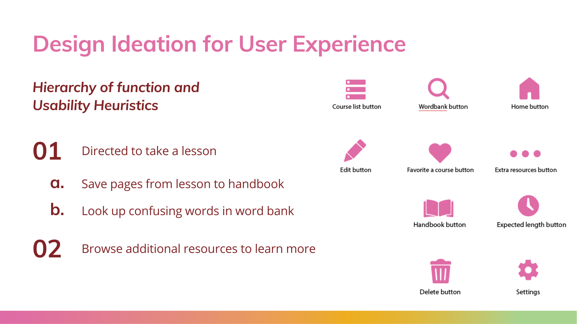
Pattern Library.

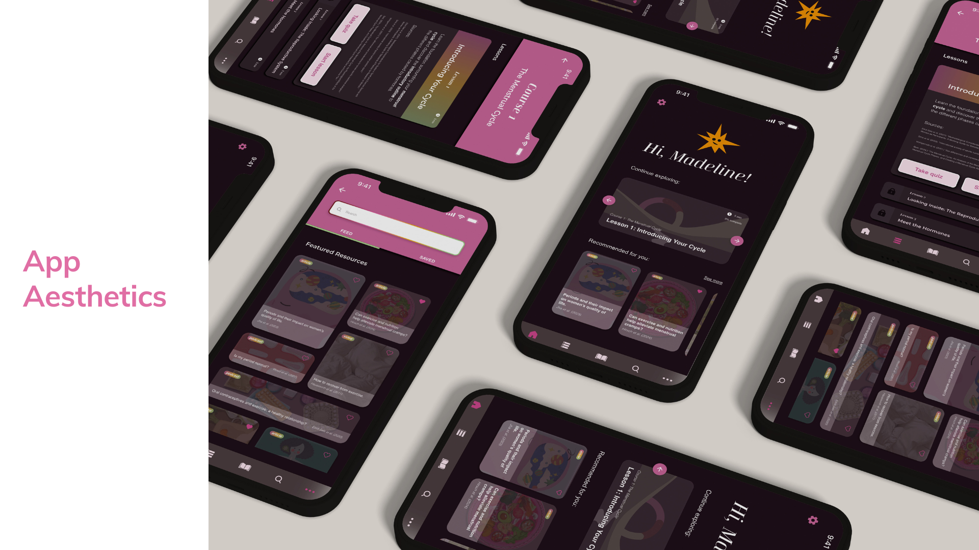
Screen examples.
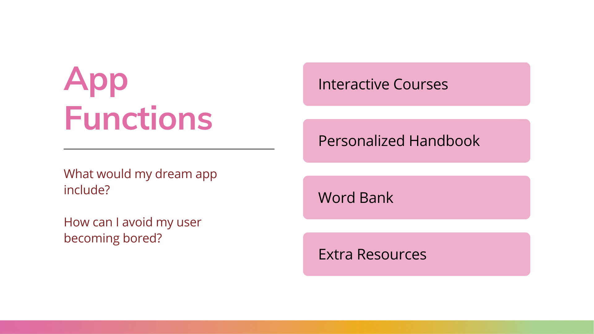
app functions
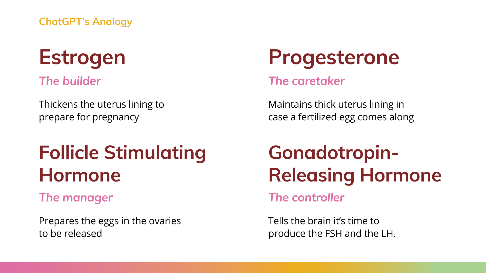
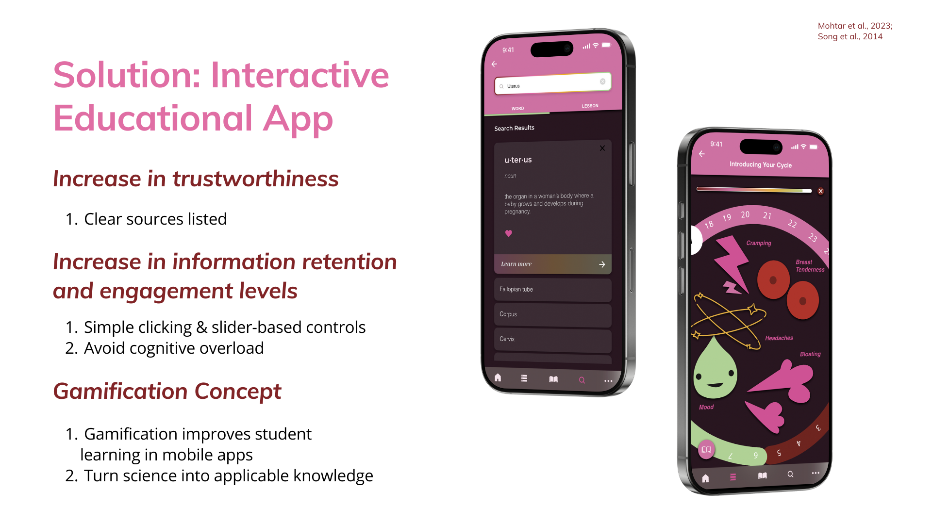
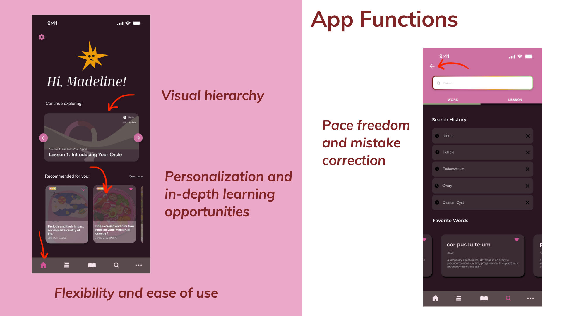
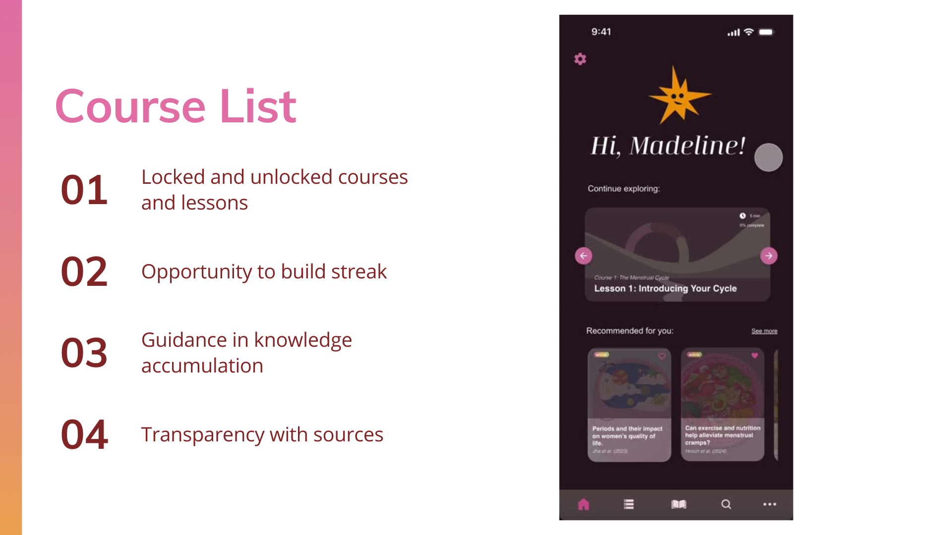
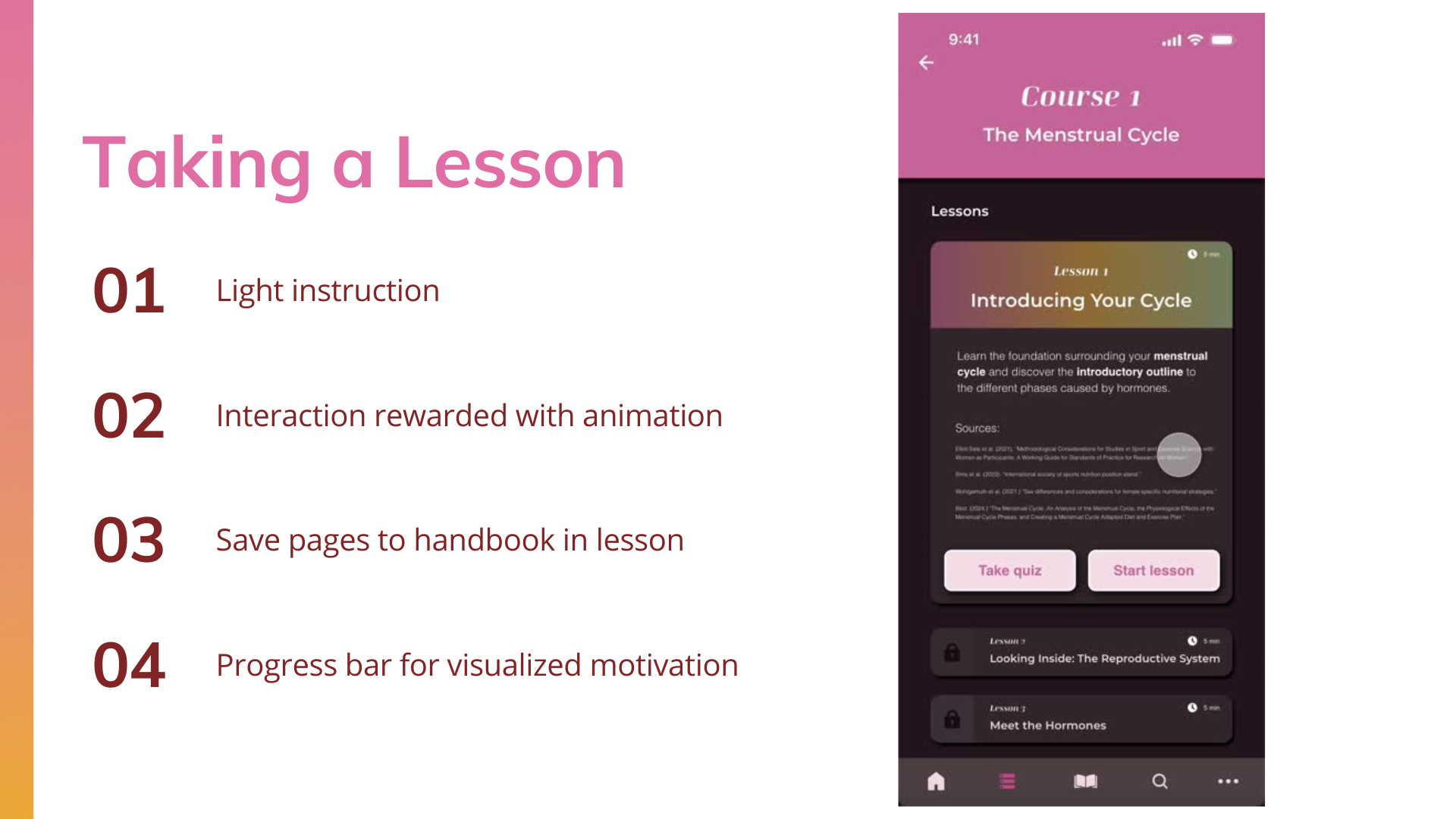
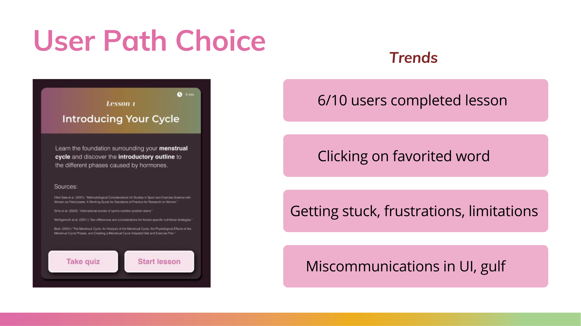
ExplorHer has four primary functions, each serving a different goal. The first main function is the course list, where users can take interactive lessons on specific hormone research, thus educating themselves on their own time, at their own pace. All lessons are researched back and aesthetically designed.
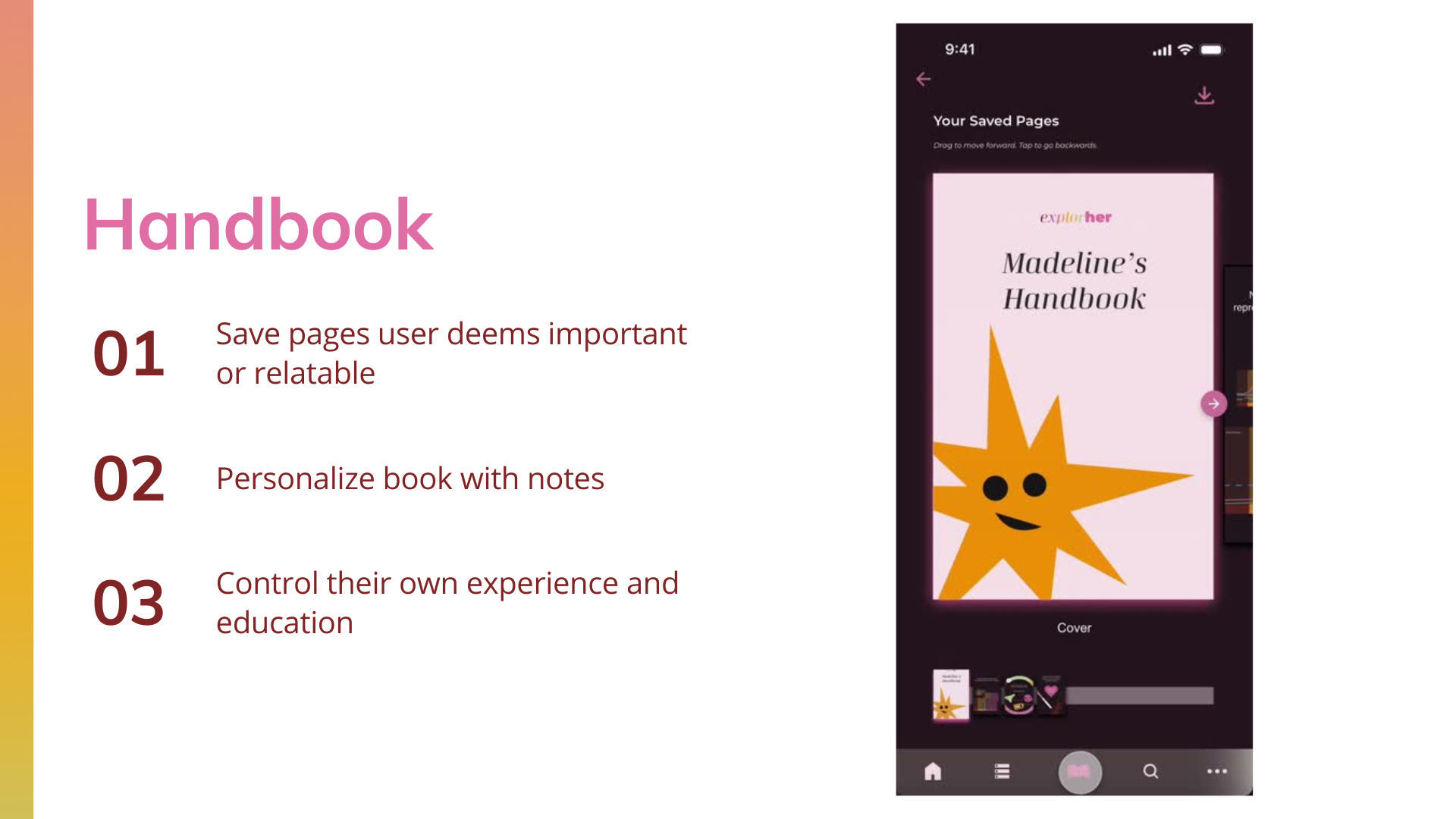
If the user feels they would like to save certain screens from the lesson, they can utilize the handbook function, saving pages to view later and build a personalized experience.
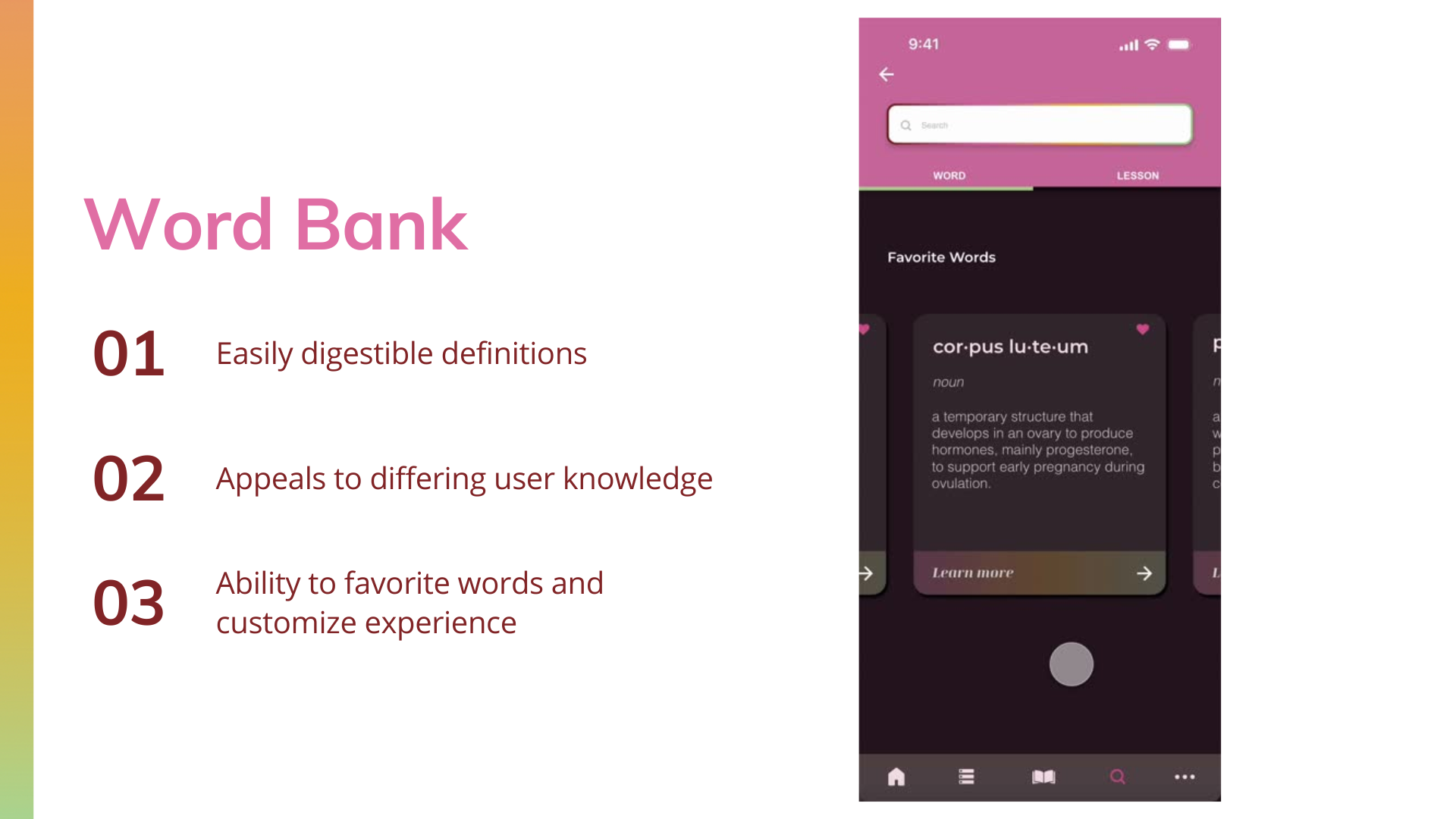
With the goal to keep the users in-app, I created a word bank for tricky words that could not be substituted with simpler language in the lessons. Users can search words, favorite them, or view lessons that correlate.
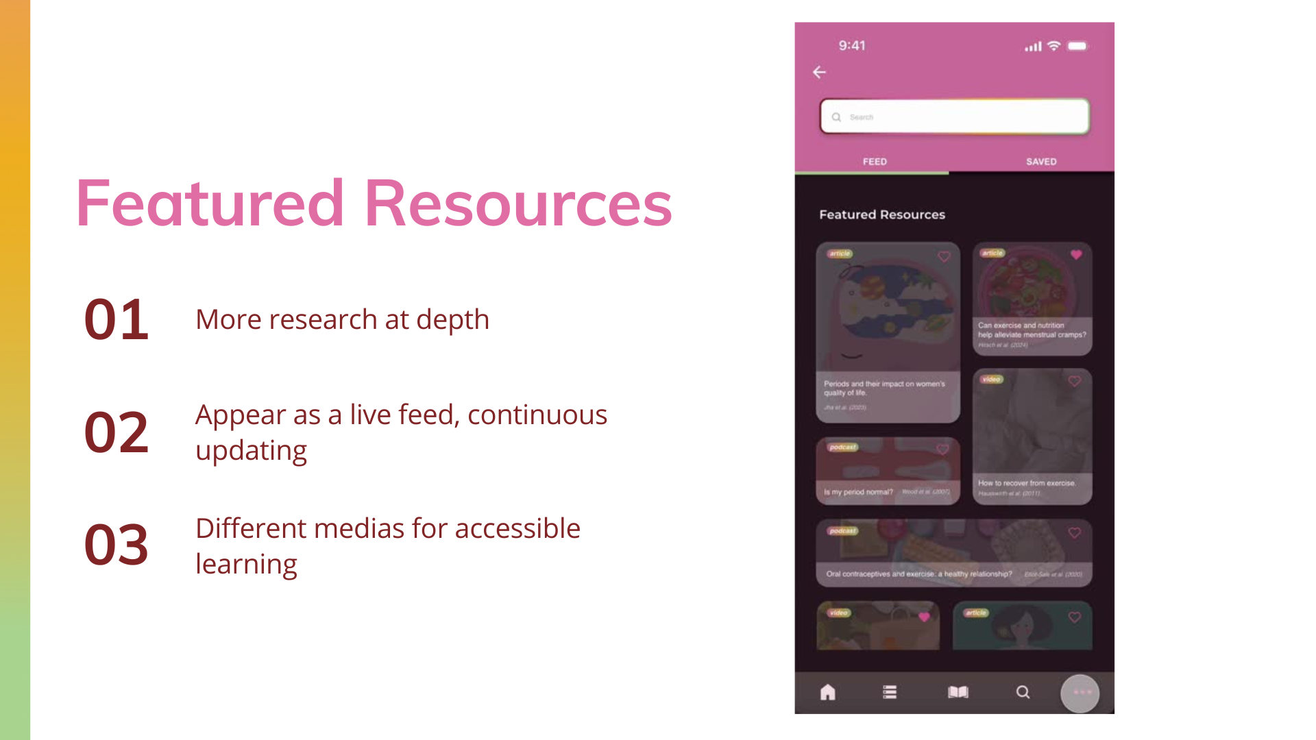
Lastly, a featured resources function includes articles, podcasts, videos and more that go more in-depth on topics that are too niche for the lessons. This allows users to explore their own interests from a reliable source.

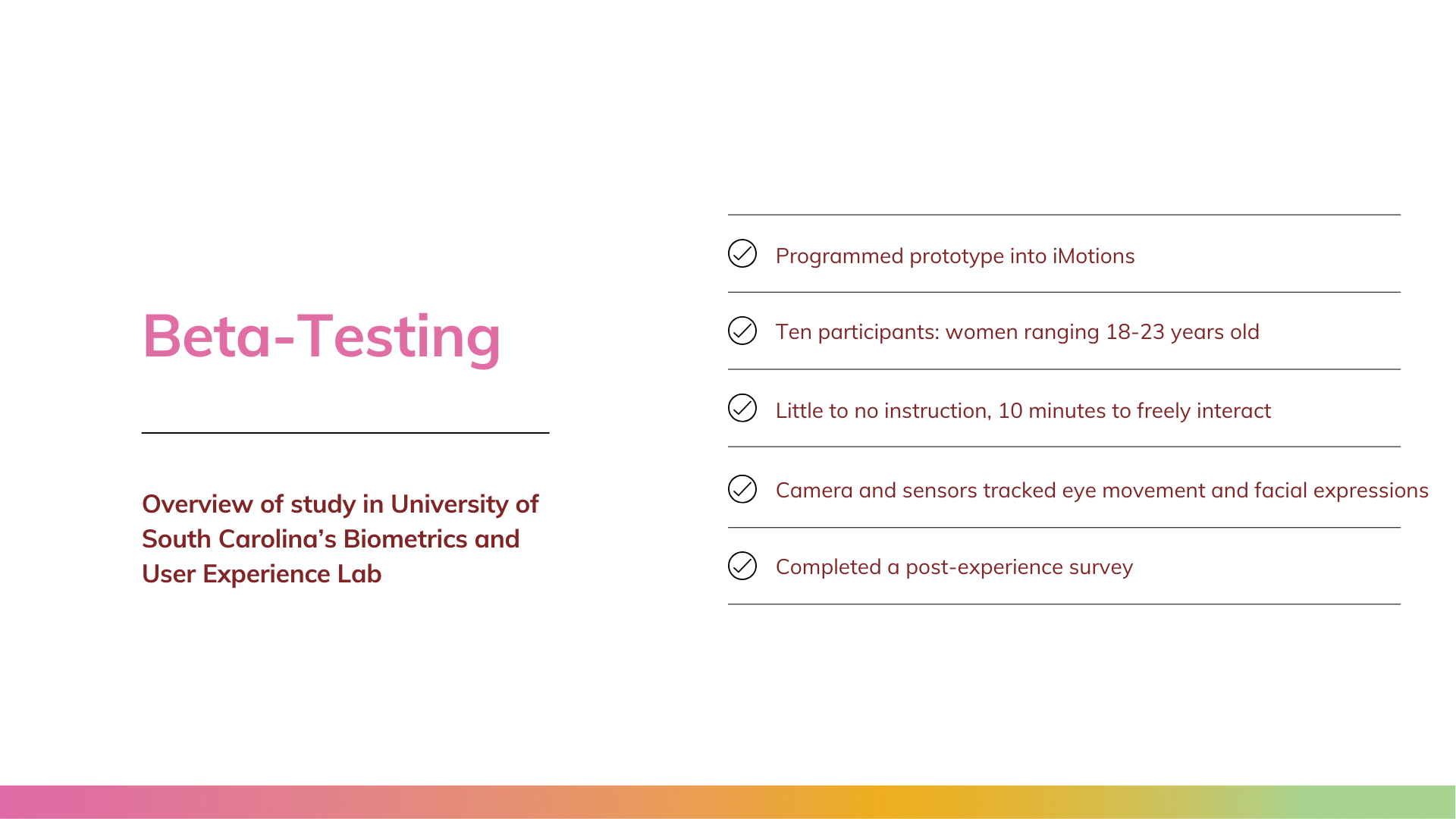
user testing and lab study
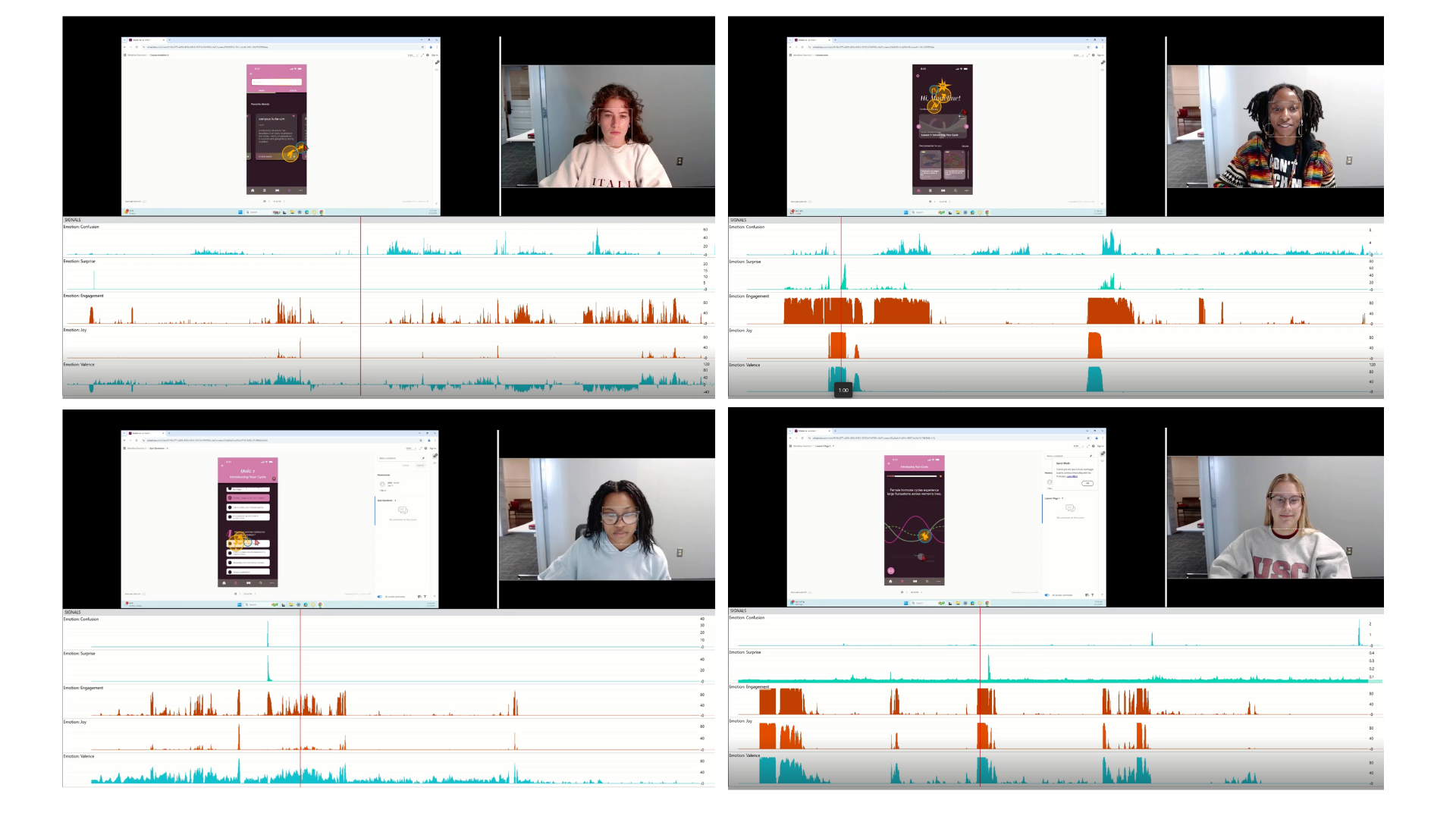
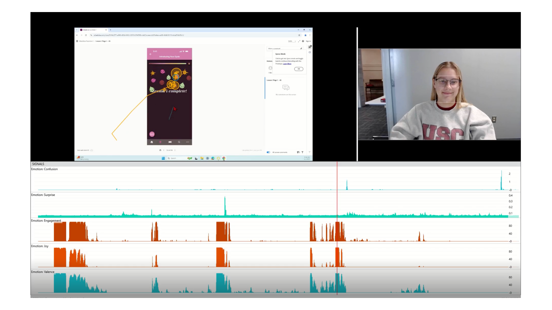
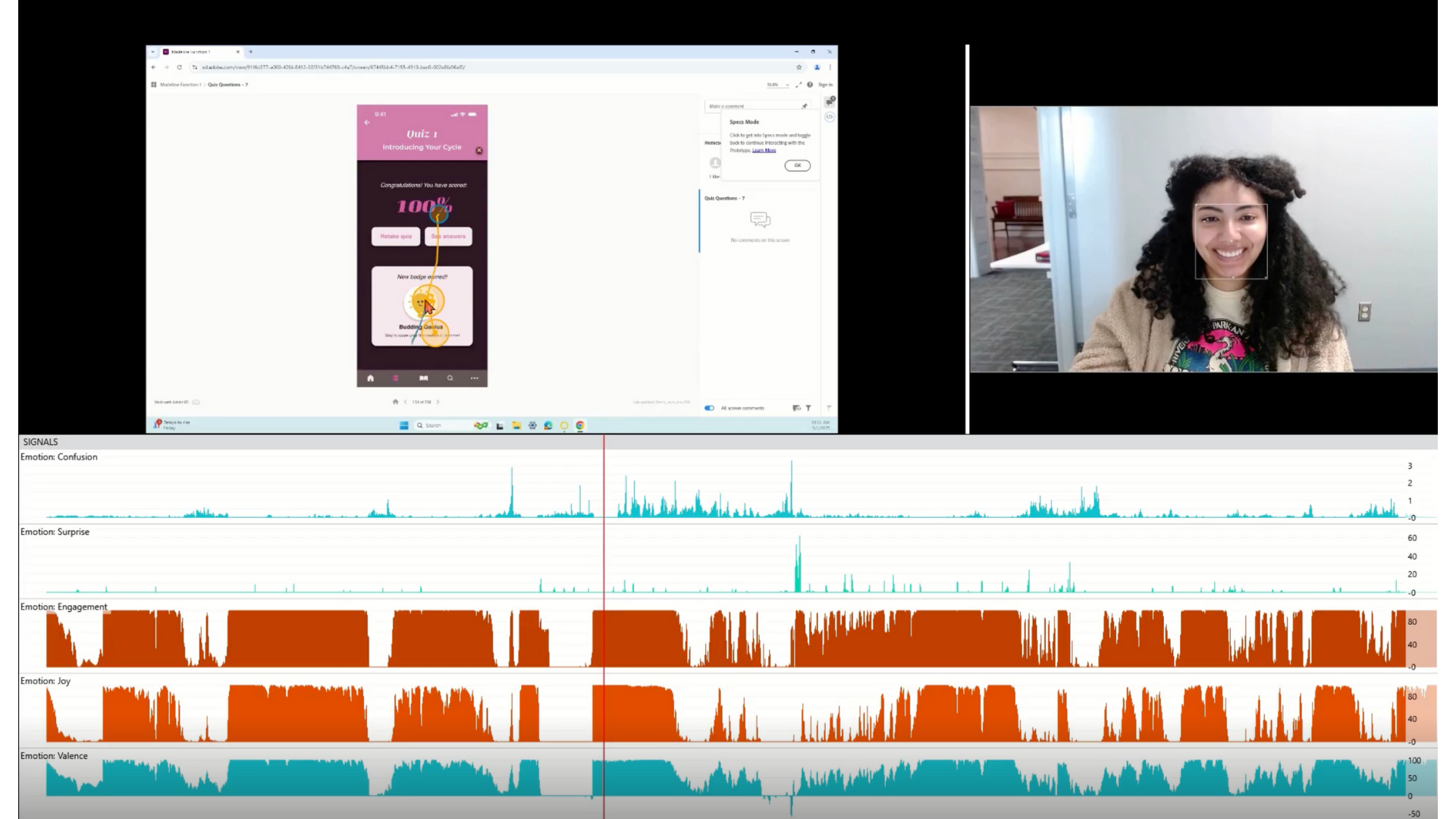
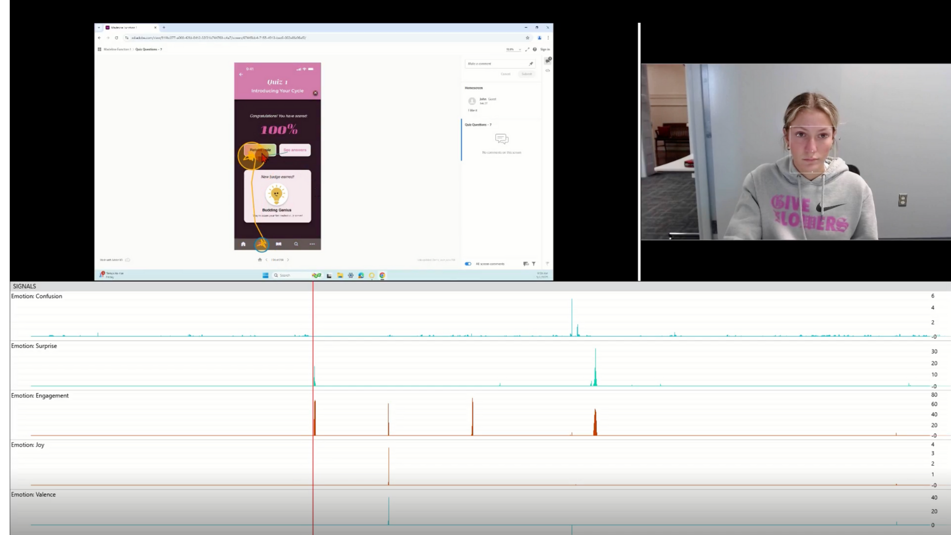
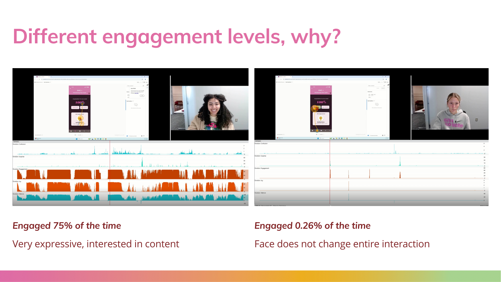
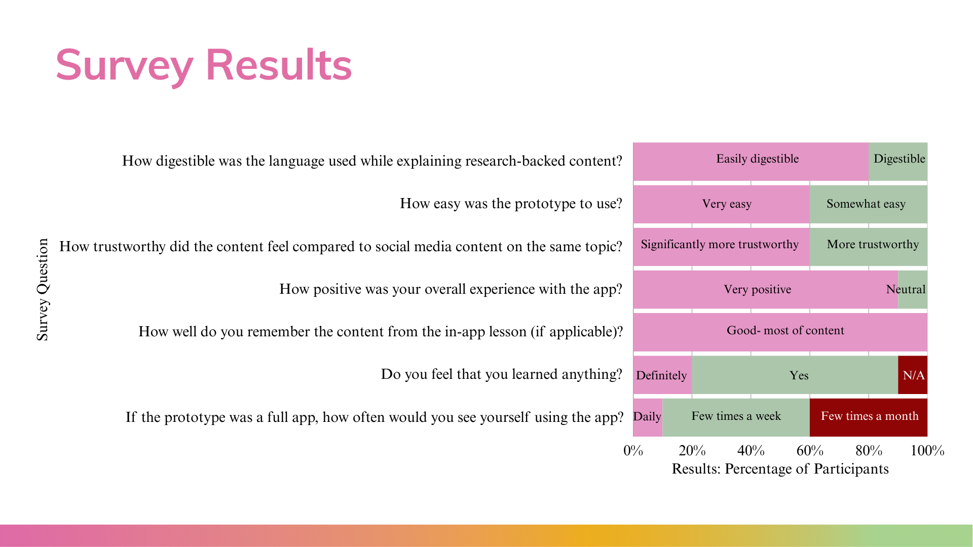
In order to truly test the successfulness of the app and its integration of research and interactive design, I completed a study in the University of South Carolina’s Biometrics and User Experience Lab. Eye-tracking data and facial expression analysis allowed me to analyze participant engagement levels and emotion types while interacting with the prototype and study fixation time on different screens. While participants interacted with the app, a camera attached to the computer screen tracked eye movement and emotion, behavioral, and facial expression signals. The participants then completed a written survey with multiple-choice answers and written responses. The multiple-choice answers were based on a scale, providing insight surrounding language, ease of us, credibility, and education retention. The written responses provided a space for more open-ended feedback, with looser prompts asking about their overall experience and suggestions for improvement.
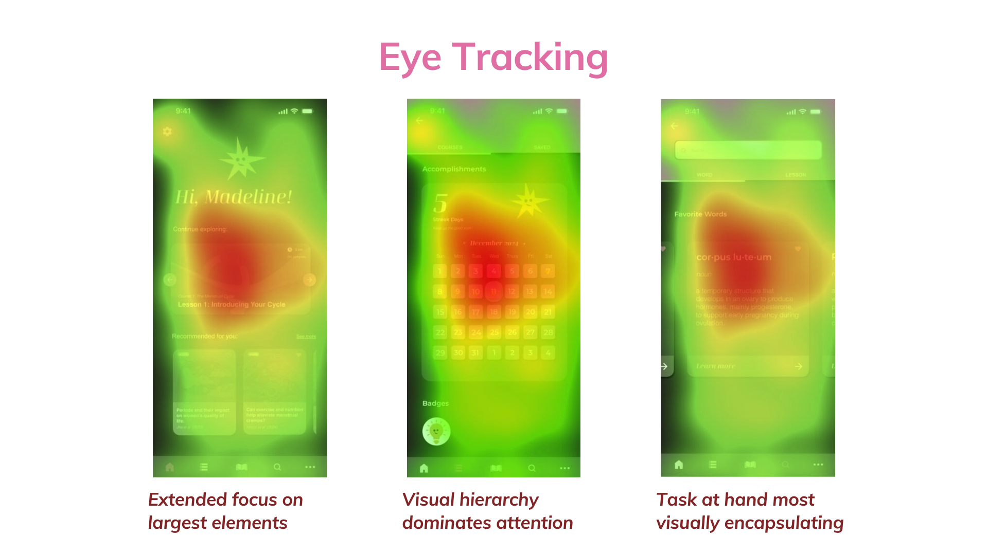
The eye tracking data provided insights into the effectiveness of my visual design choices. The heat maps provide a visualization of which parts of the prototype attract visual attention. Overall, the heat maps deemed the design as successful in capturing visual attention and encouraging engagement.

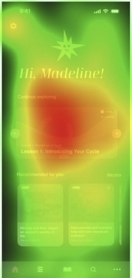

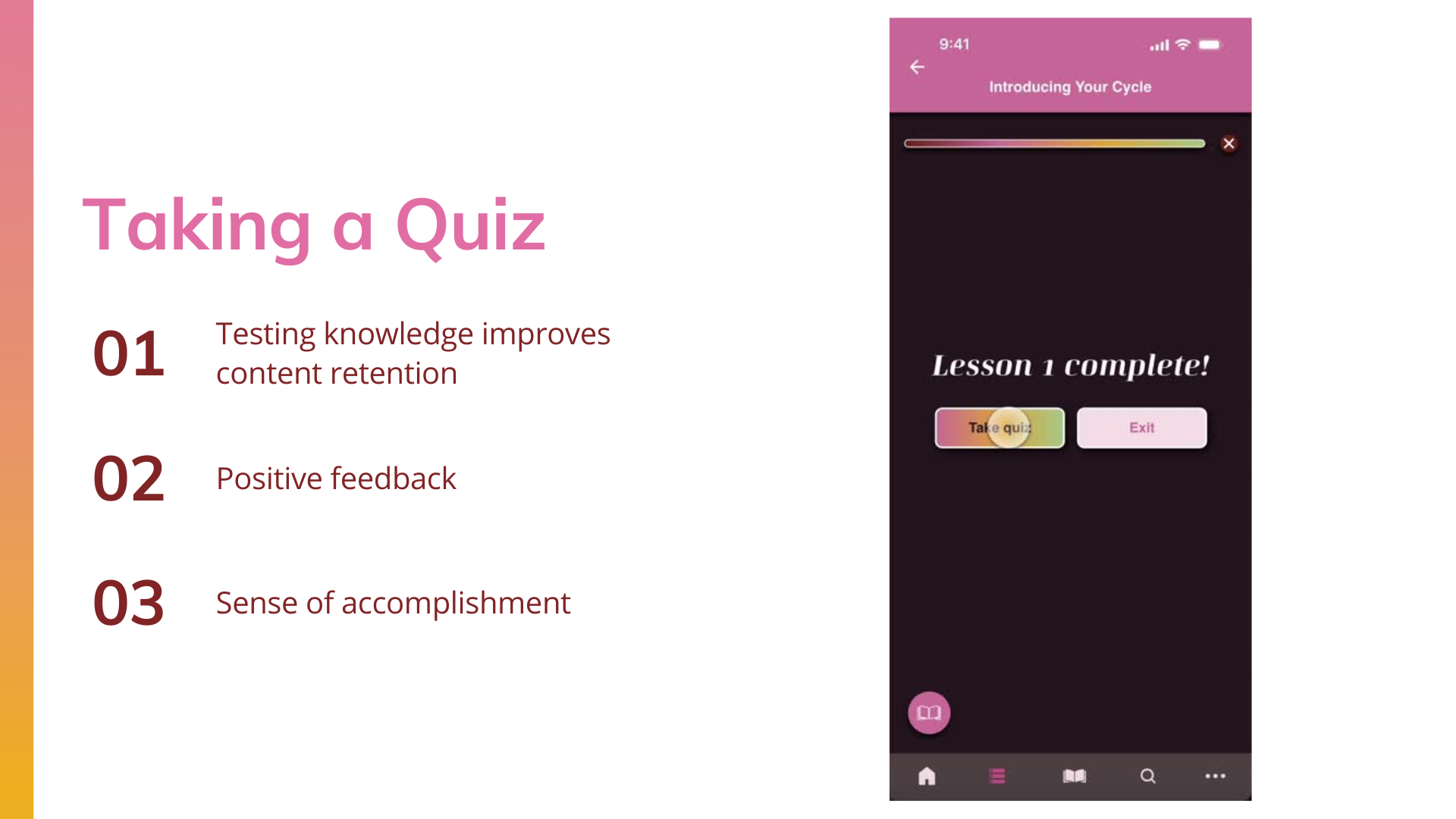
For this study I focused on the following emotions: confusion, surprise, engagement, joy, and valence (pleasantness vs unpleasantness). Peaks in joy surrounded small animations such as the “lesson completed message” while peaks in engagement and confusion were common during the quiz. The quiz required direct thought and choice while the lesson only required a click forward, explaining why engagement appeared to be higher during the quiz section. However, the drag feature in the lesson almost always caused a spike in engagement, breaking the norm of the interaction that had involved only clicking prior. Attention rates ranged between 98-100% of the time spent in the interaction. I believe the data demonstrates the integration of research and design through this prototype as an efficient method of presenting research on the female hormone cycle to young women.
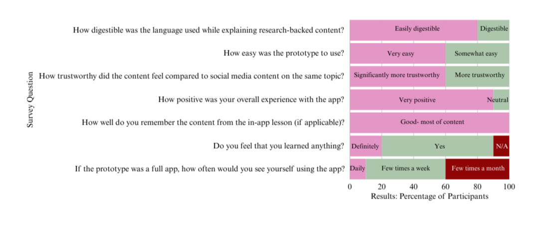
Survey questions focused on the purpose of this study, asking about the ease of understanding language, trustworthiness of the app, content retention, and learning experience. The diagram to the left visualizes the results.
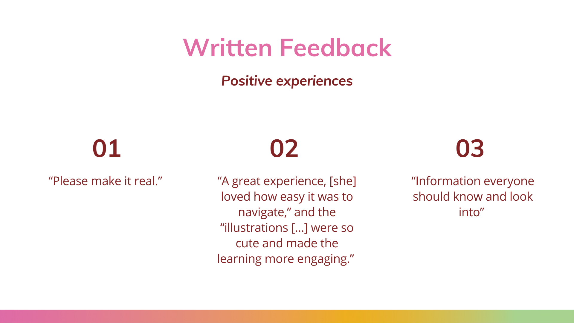
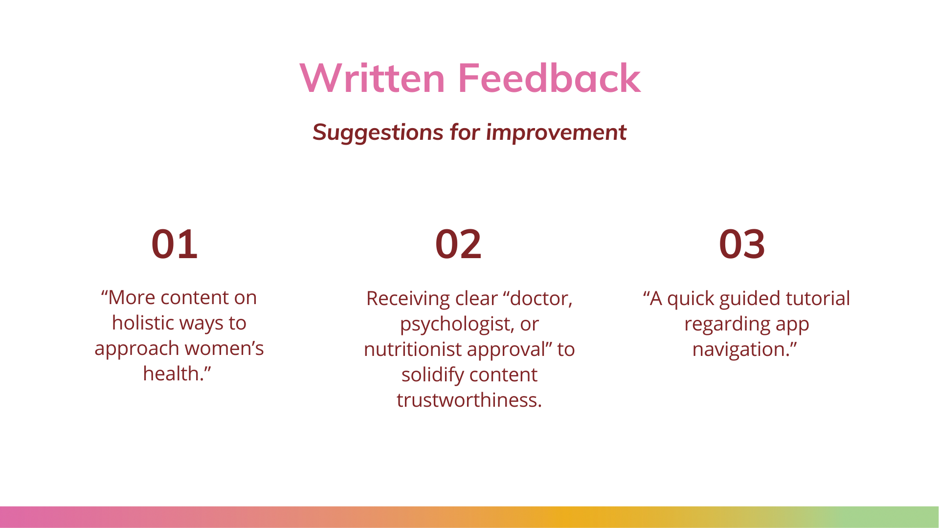
The written feedback was overall positive, one participant wrote it was “a great experience,” she “loved how easy it was to navigate,” and the “illustrations [...] were so cute and made the learning more engaging.” Several participants commented they hoped the prototype would be developed into a full app one day. Recommendations included “more content on holistic ways to approach women’s health,” “a quick guided tutorial regarding app navigation,” and receiving clear “doctor, psychologist, or nutritionist approval” to solidify content trustworthiness. Several other trends in the feedback included praise for the visual aesthetics, options for different media in the featured resources, visibility of credible sources, logical organization of content, and easily understandable language.
the presentation and defense
In order to successfully graduation and solidify this project, I had to defend my research to a panel of professors, researchers, design professionals, and friends. I designed, practiced, and created the following presentation to summarize all of my data and keep the audience engaged and interested.

No time to explore?
If you would rather watch a quick demo on how to use the app, go ahead and watch my demonstration on navigating the prototype.
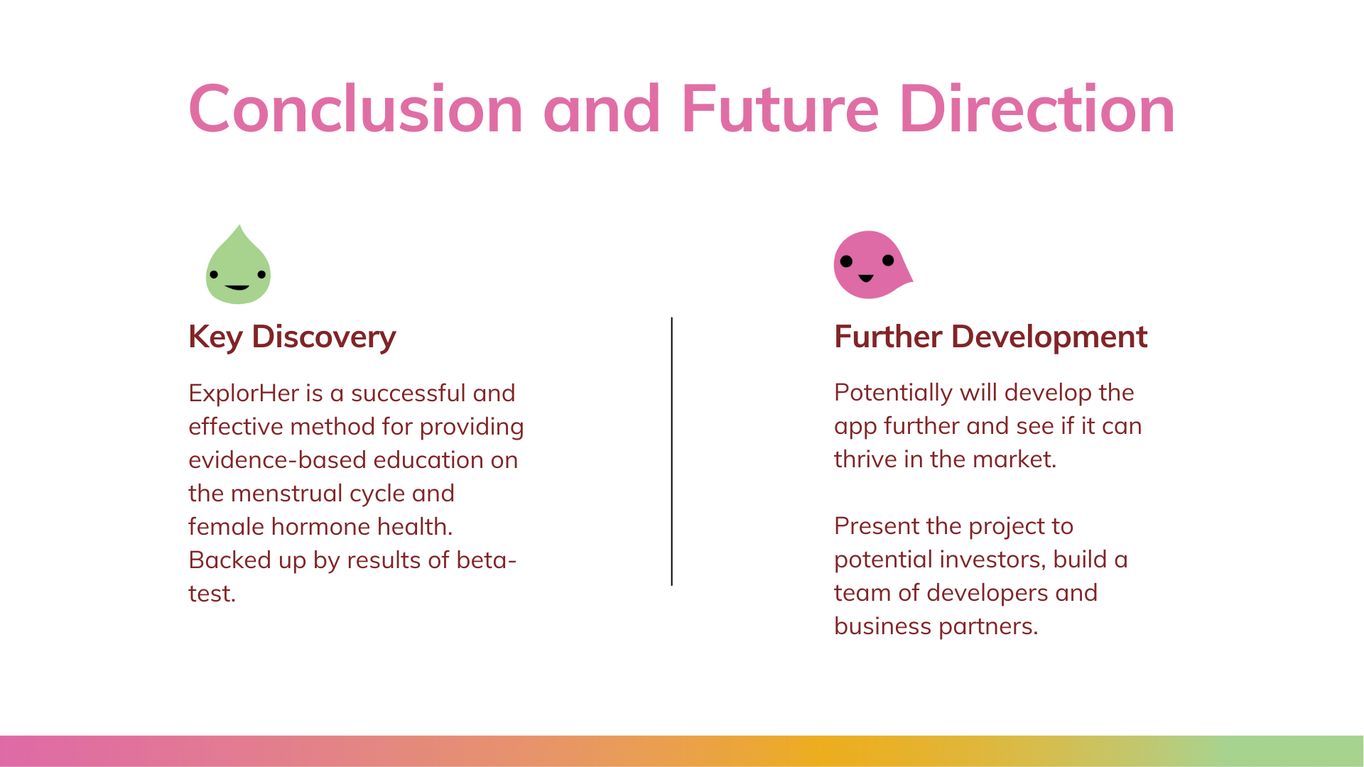
in conclusion
The ExplorHer app prototype was a successful and effective method for providing evidence-based education on the menstrual cycle and female hormone health. Through this process, I learned how to translate research into an easily digestible, but educational format, through aesthetic design and interaction. Results of the beta-test indicate that the design is visually engaging and generally a positive experience, supporting the ExplorHer mobile app to be an effective format for content presentation