

somos pilates
brand identity designer
While working at JWD Creative, our agency was approached by a new pilates studio opening in Kansas City. We were asked to create a brand identity for the studio, complete with logos, colors, and supporting applications. Please note, my concept shown on this page was not the final direction that the client ended up choosing.
the research
Although I have attended many pilates classes, my team and I went to a local reformer pilates studio to take a class and truly understand the format and our client’s passion. We all left the class not only sore, but inspired and well-informed on the intricacies behind pilates. My biggest take away was feeling all of my muscles work together, even the small ones that I don’t normally engage. At the heart of the workout, my core was stabilizing myself on the machine and allowing for every movement to be intentional and controlled.


I started my process with creating a mood board. Not only did this help me choose warm, inviting colors, but I established the positive energy, self discovery, beautiful attributes of nature, and fluidity I wanted to pull into my design.
the concept
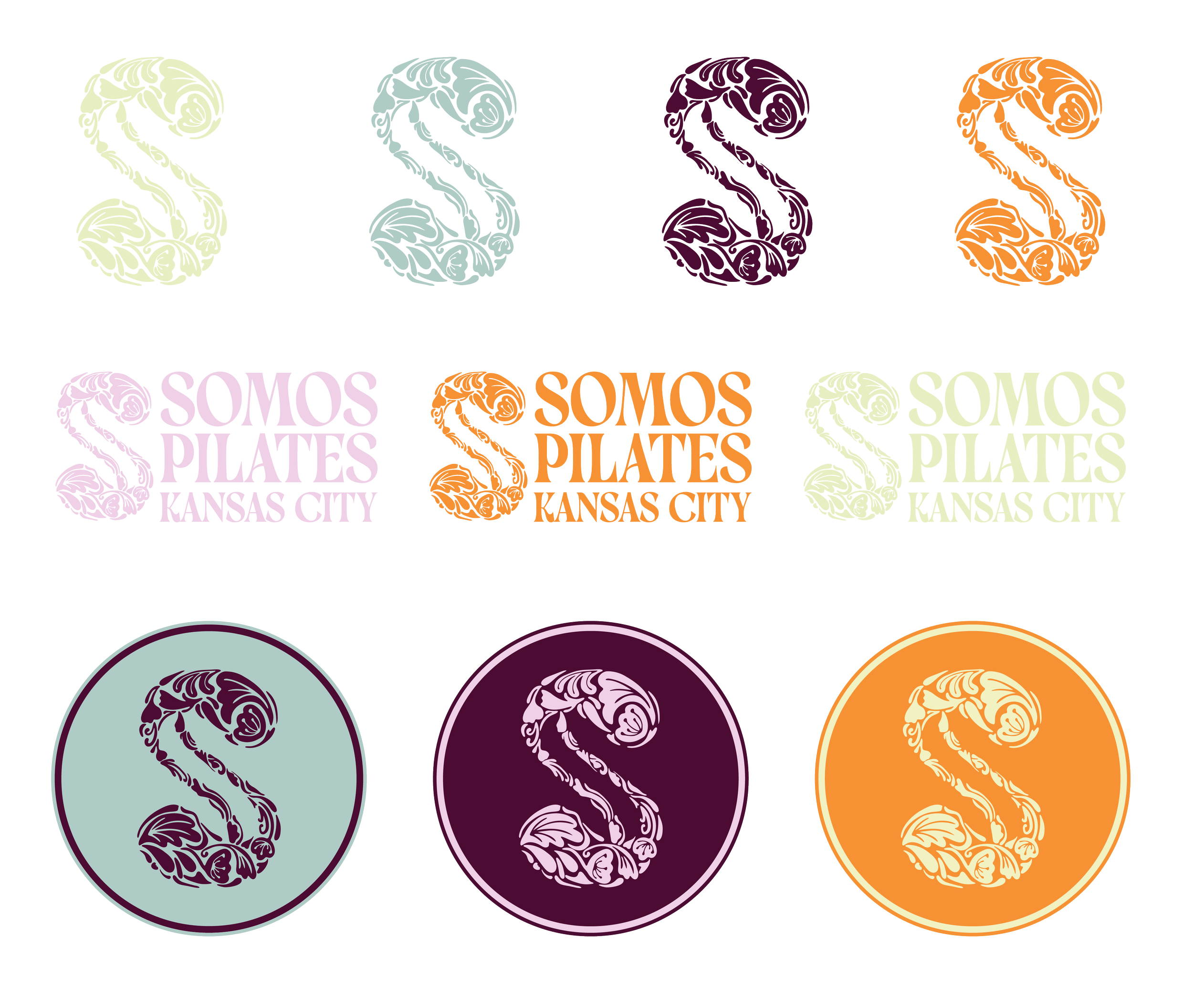
While creating the logo, I wanted to discover a visual representation of all the muscles fitting together perfectly in a harmonious manner. Simultaneously, my design had to capture the bend, flow, and natural coordination found not only in pilates movements, but also in the natural world. The floral and plant pattern succeeded in symbolizing the connectivity and natural harmony of both nature and the human body. I purposefully left negative space in the middle of the initial as the representation of our core unifying our many different body parts at the center.
The client desired an inclusive, elegant logo with several lockup options. My design allows for variations and flexibility with pattern play while inviting growth for every member!
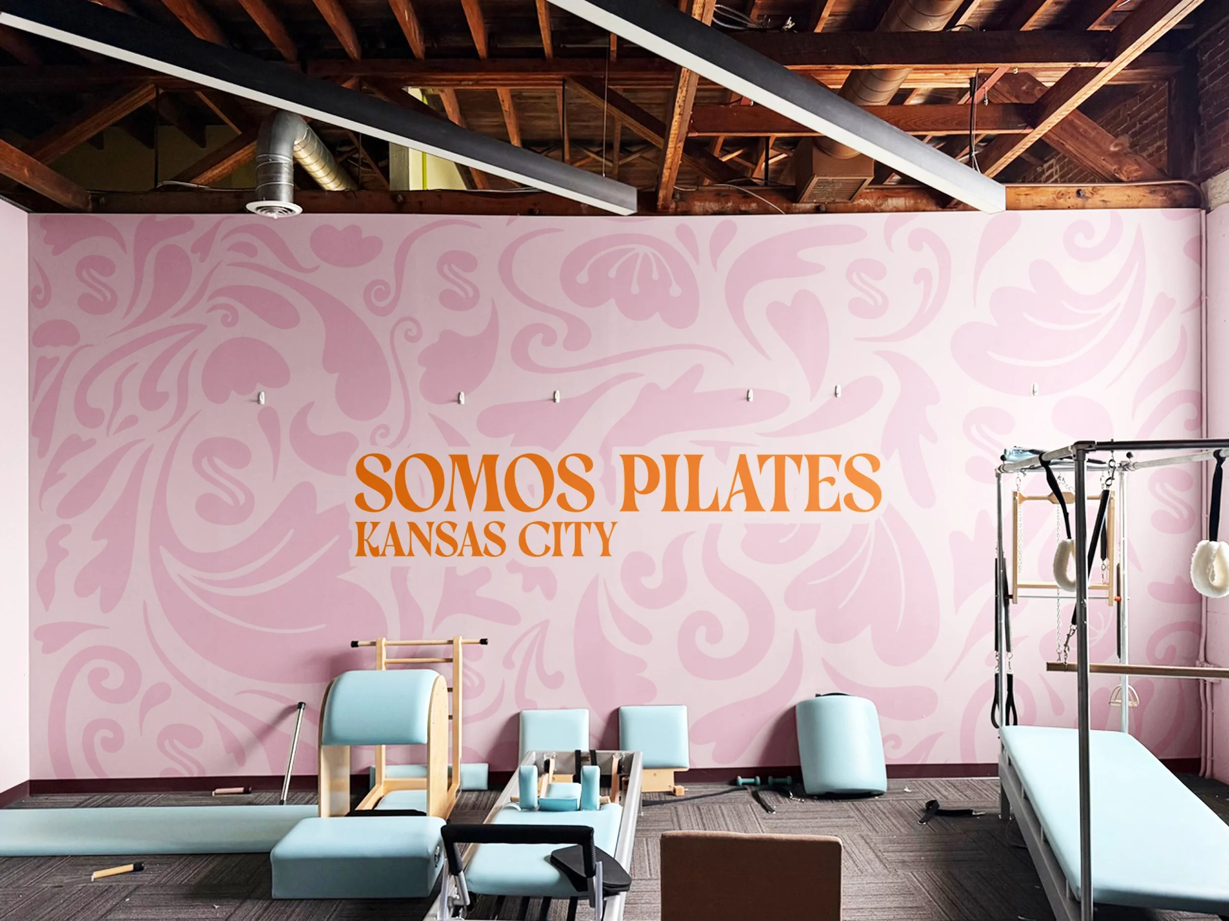
A custom wall mural for the interior of the studio
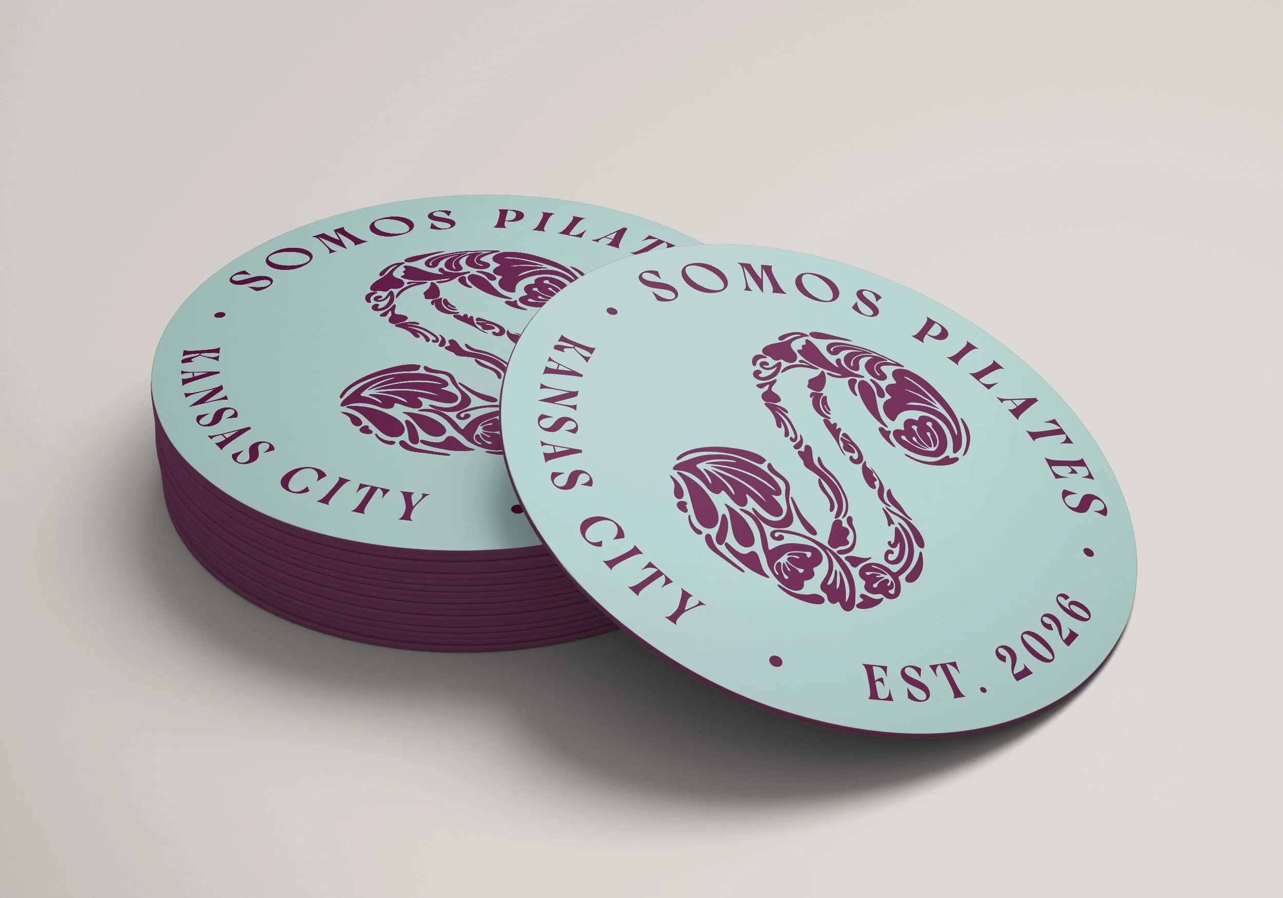
Coasters for the client's love of diet coke
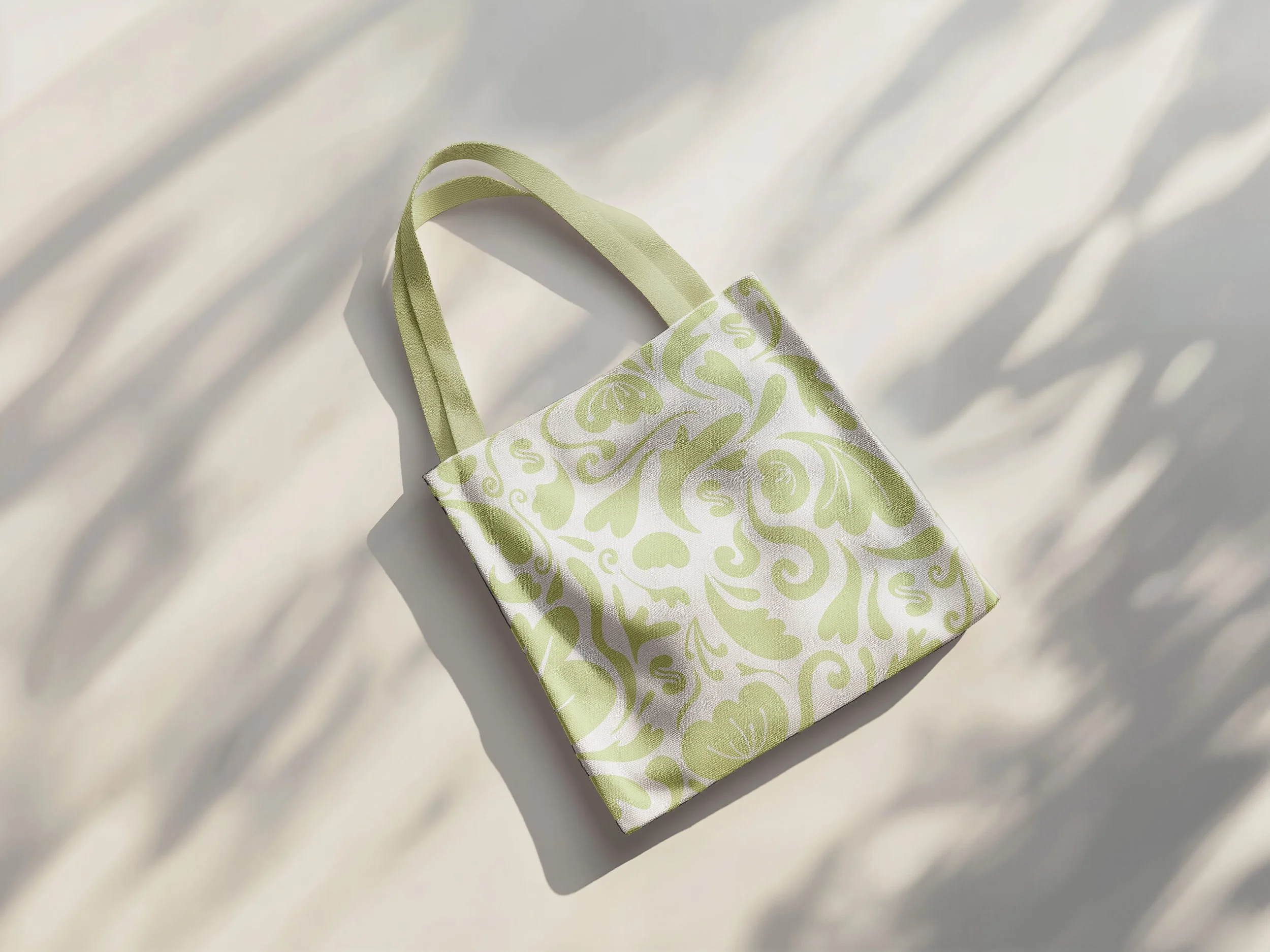
Merchandise for members
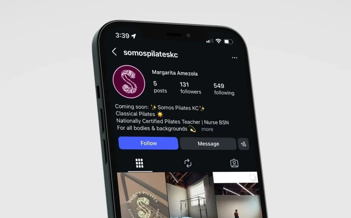
Instagram profile picture

Exterior window signage